

CASE STUDY: DAE HAIR APP
Dae Hair is a clean, desert-inspired haircare brand based in Arizona, known for its simple, effective formulas infused with desert-derived botanicals and dreamy, orange-blossom–forward scents. The brand emphasizes everyday self-care, approachable luxury, and a warm, sunlit visual identity that carries through its packaging, photography, and digital presence.
Dae currently reaches customers primarily through its e-commerce site and retail partners like Sephora, which creates an opportunity for a dedicated mobile app to streamline shopping and deepen brand loyalty. As a designer, the goal was to imagine what a Dae Hair app could look and feel like if it translated the brand’s calm, desert-inspired experience into a focused mobile shopping product.
PROJECT GOALSDesign an intuitive shopping app for Dae that makes it easy to explore categories, view product details, and complete purchases.
Maintain visual and tonal consistency with Dae’s existing brand world, from color palette to photography style.
Support key e-commerce behaviors: browsing, saving items, and managing an account.
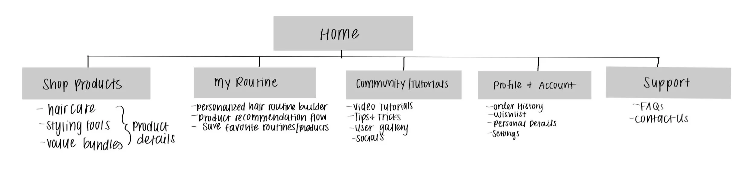
APP STRUCTURE & SCREEN TREEThe project began with an app screen tree to define the core structure and primary user flows. Instead of building every possible feature, the focus was on what would be essential for a first version of a Dae app.
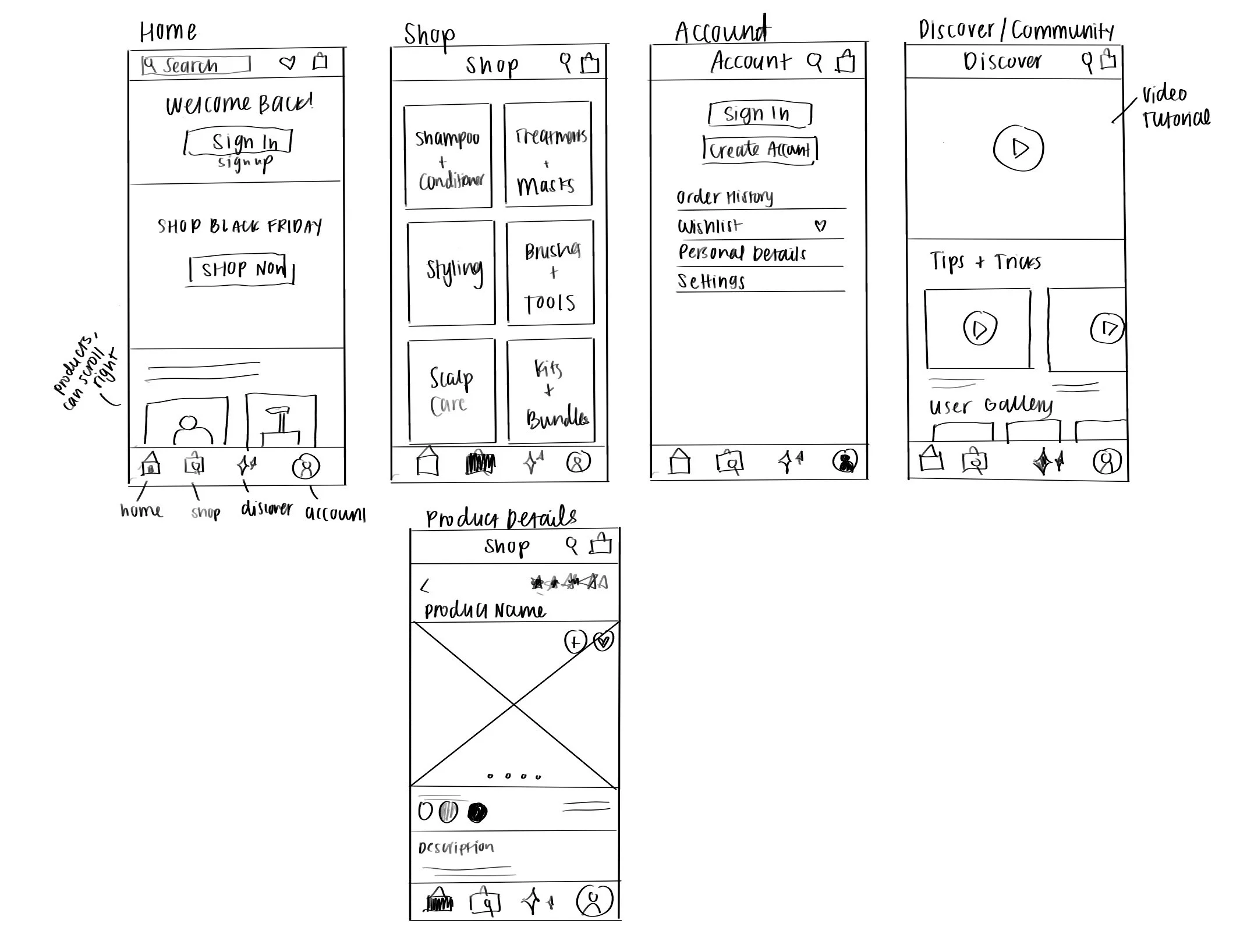
WIREFRAMES & NAVIGATIONAfter mapping the structure, mid-fidelity wireframes were created to work through layout and navigation before visual styling.
Key wireframes included:
Home: A welcoming screen with Dae-branded imagery, clear calls to sign in or sign up, and entry points into featured products or categories.
Bottom navigation bar: Four primary tabs—Home, Shop, Discover, Account—to create consistent navigation across the app.
Shop page: A product grid organized into sections like “Shampoo & Conditioner” and “Treatments & Masks,” reflecting how products are grouped on the site.
Product detail page: Focused on large imagery, concise product descriptions, ingredients, benefits, and key actions like “Add to Cart” and “Add to Wishlist.”
Account page: Including order history, wishlist access, and standard account settings.
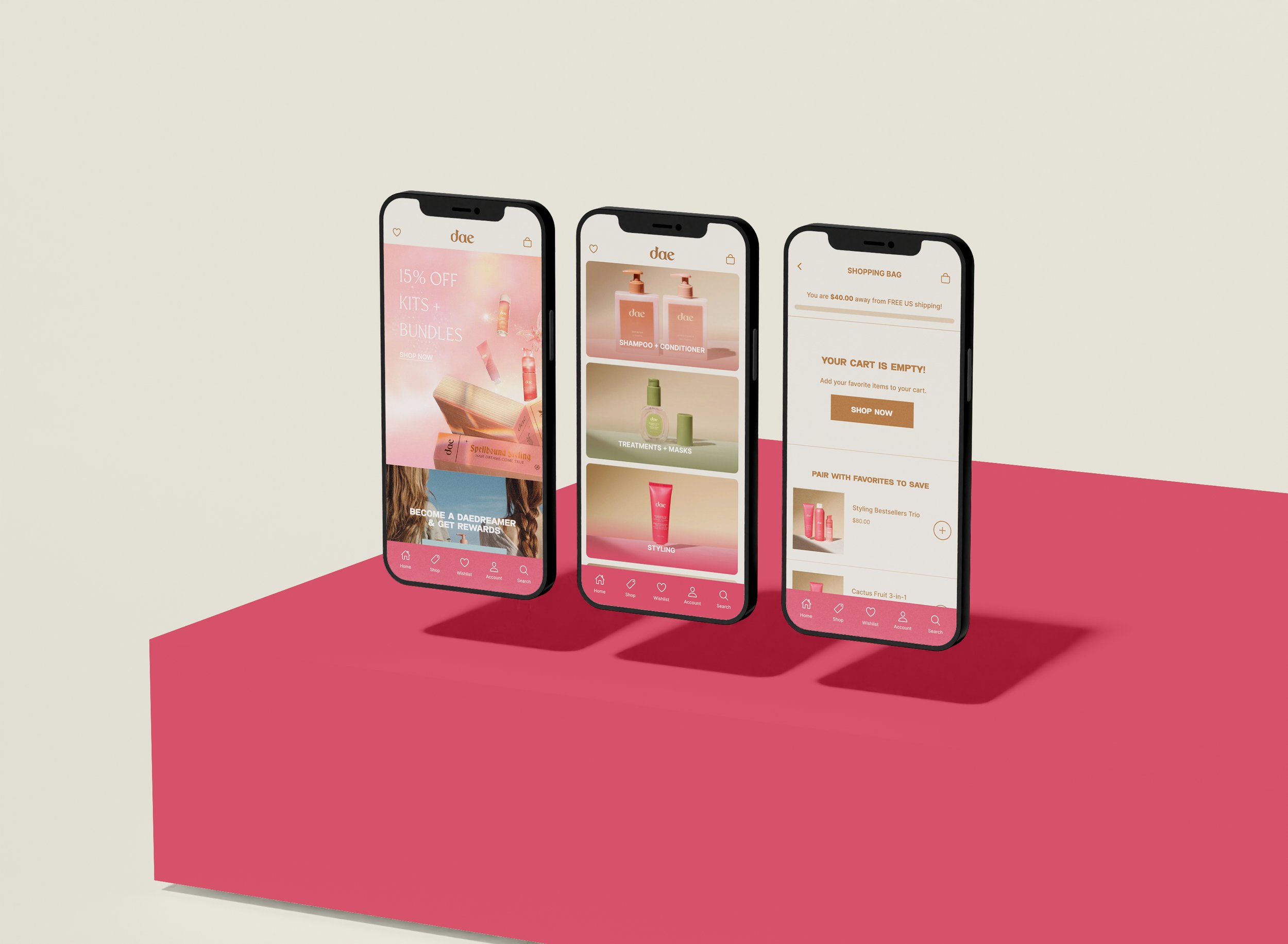
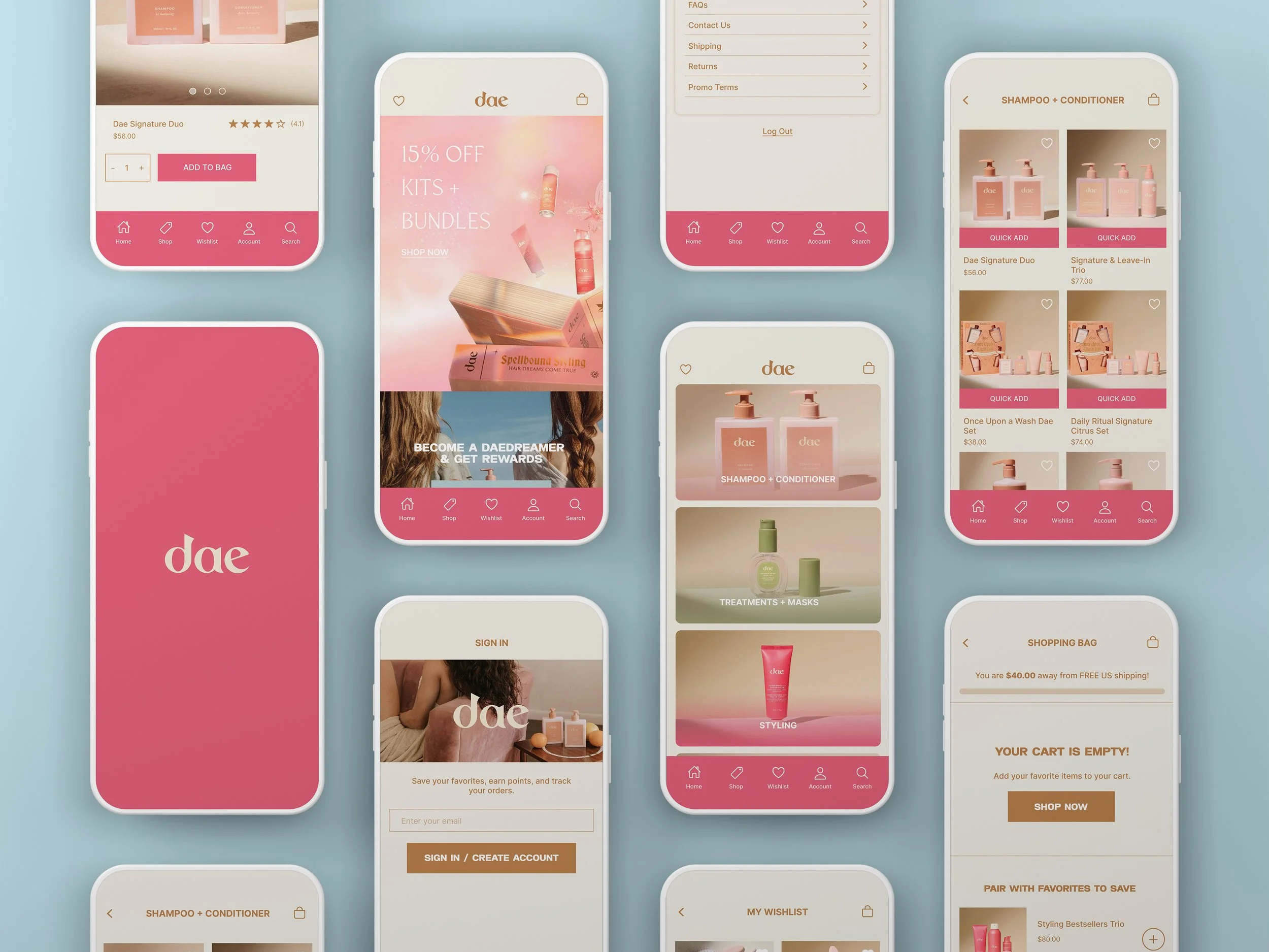
FINAL UI & KEY SCREENSFor the final designs, the scope was intentionally narrowed to the most essential screens for a shoppable, brand-aligned app. The visual direction drew from Dae’s existing palette of warm neutrals, desert tones, and soft gradients to evoke a calm, sunlit feel.
Final screens included:
Home: A clean, welcoming entry with brand photography, featured products, and clear navigation onward into the Shop.
Shop: A structured list or grid of product categories and items, making it easy to scan and compare offerings like shampoos, conditioners, masks, and styling products.
Product details: Rich product pages combining imagery, benefits, usage info, and key actions (add to cart, add to wishlist) to support decision-making.
Wishlist: A dedicated space where users can save products they are considering, supporting browsing behavior that doesn’t always end in an immediate purchase.
Shopping cart: A streamlined cart and checkout entry point to reduce friction at the moment of conversion.
Profile/Account: A hub for order history, personal information, and settings, giving users confidence and control over their relationship with the brand.
By focusing on these screens, the app concept became a solid foundation for Dae’s digital ecosystem.
FINAL REFLECTIONThe main challenge in this project was defining a realistic scope for a “first version” of a Dae app while still honoring the richness of the brand story.
This project reinforced the importance of:
Letting brand values guide design decisions, without overshadowing usability.
Starting with a solid information architecture and then selectively deepening screens that matter most.
Accepting that not every idea needs to be fully built in the first iteration; a strong foundation is often more valuable than an overextended feature set.